California Fried Chicken (CFC): Balancing Heritage and Modernity through Visual Identity Design

Reimagining a Fast-Food Classic
Background
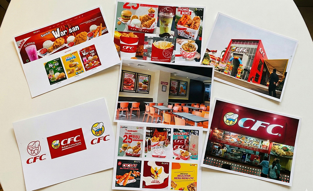
California Fried Chicken (CFC) is an Indonesian fast-food chain established in 1983, known for its affordable and family-friendly dining experience. Over time, inconsistencies across packaging, advertisements, and digital platforms weakened the brand’s visual identity. While the Conestoga wagon remained a recognizable symbol, the overall branding felt outdated and lacked cohesion.
Project Goal
To redesign CFC’s outdated and inconsistent branding into a cohesive, modern identity that stands out from competitors while creating a visual system that appeals to families and middle- to upper-middle-class customers.
Project Research: Analyzing CFC’s Brand Identity and Market
Initial Research & Insights
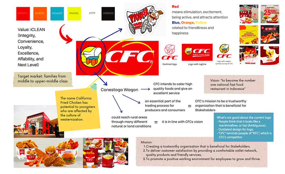
I began by examining why CFC’s branding felt inconsistent and less competitive within Indonesia’s fast-food market. I analyzed core brand assets—including the logo, color palette, typography, packaging, outlets, website, and social media—while benchmarking competitors such as McDonald's and KFC. CFC has a target market of families from middle to upper-middle class
Through this audit, I found that although CFC uses bright, appetite-stimulating colors and friendly graphics, these elements are applied inconsistently, weakening visual cohesion. According to preliminary publications and researches, the Conestoga wagon logo also appears ambiguous to the audience, while packaging and social media visuals vary in style and fail to reinforce a unified identity. These findings highlighted the need for a clearer visual system that strengthens recognition while preserving the brand’s heritage.
Strategy & Positioning
Based on these insights, I focused on simplifying CFC’s visual language while preserving the Conestoga wagon as a heritage element. I developed a cohesive system of color, typography, and illustration to create consistency across packaging, digital platforms, and promotional materials while reinforcing a fun and family-friendly brand personality.
The Process: Shaping the CFC Identity
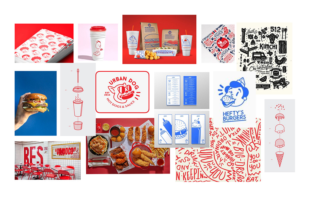
1. Moodboard & Visual Exploration
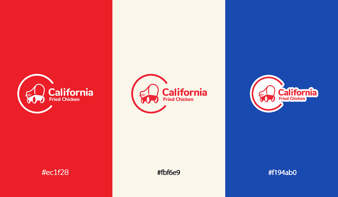
Before sketching, I created a moodboard to define the visual direction and brand personality. I focused on red and blue as the core palette—red to stimulate appetite and energy, and blue to convey trust and reliability. I explored typography, imagery, and graphic elements that could express a playful and approachable identity.
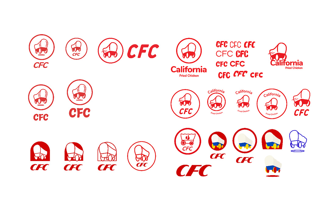
2. Preliminary Logo Sketches
To maintain continuity with CFC’s identity, I kept the Conestoga wagon as the central element. I experimented with different perspectives, proportions, and shapes of the wagon, including the idea of incorporating a chicken. The sketches focused on simplifying the wagon while ensuring it remained recognizable and visually distinctive.
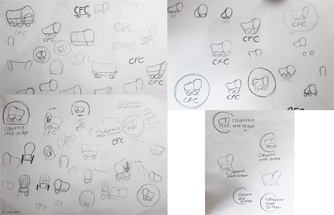
3. Digital Exploration & Refinement
I digitized the sketches and explored variations in color, composition, and typography. While I initially tested yellow and additional graphic elements, these options added unnecessary complexity and raised scalability concerns. I ultimately focused on the wagon and the full brand name, “California Fried Chicken,” to clearly differentiate the brand from competitor KFC.
The Final Designs: Creating Consistency Across CFC’s Brand Touchpoints
Logo
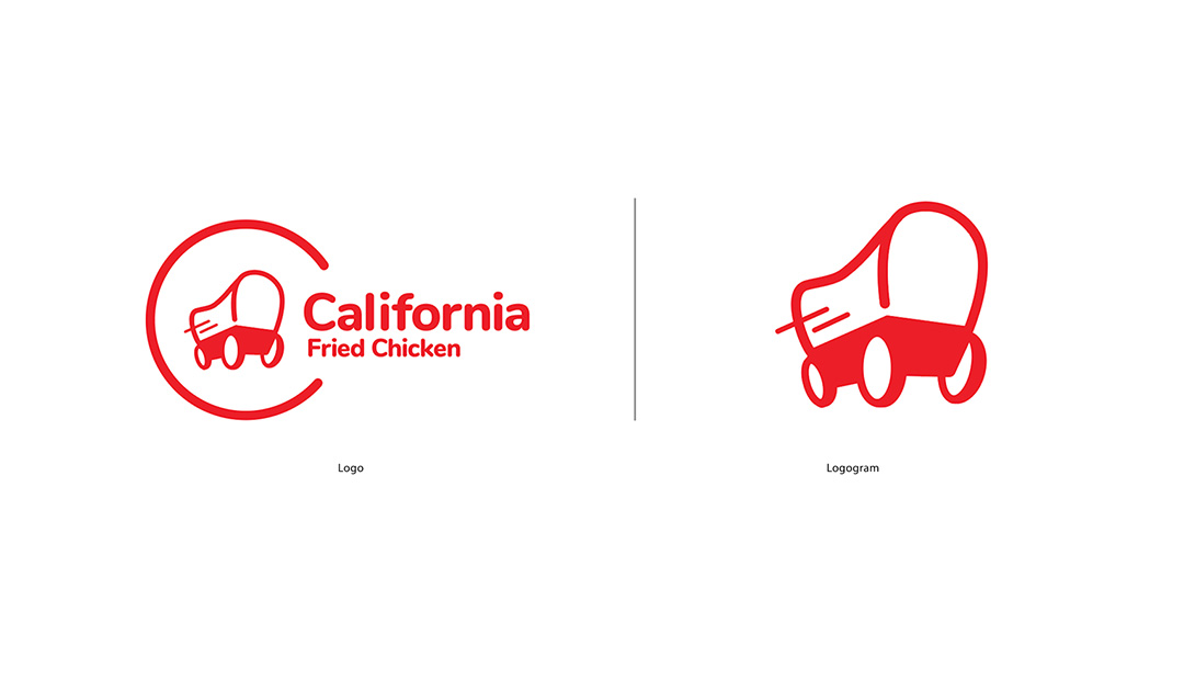
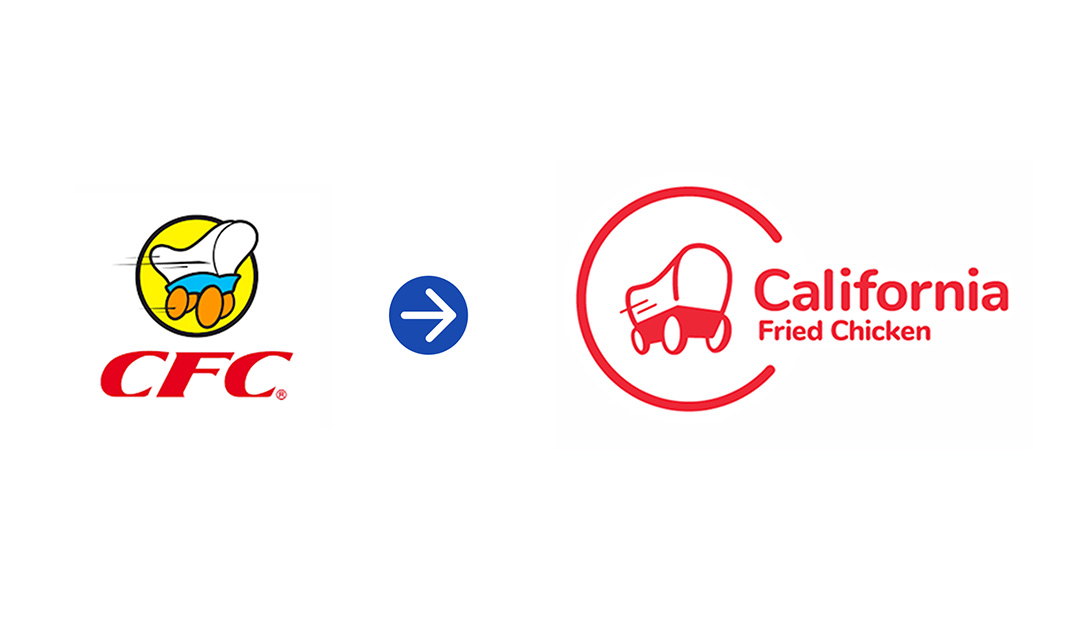
The final logo features a minimalistic Conestoga wagon with rounded corners to create a friendly and modern appearance. I retained two motion lines from the original logo to suggest movement and energy, while placing the wagon inside a circular “C” to create a sense of unity with the brand name. I chose this direction for its modern and simplified form, which improves scalability, clarity, and recognizability across different applications while preserving the brand’s heritage.
I chose red to stimulate appetite and attract attention, supported by a palette of red, beige, and blue to balance energy with reliability. Compared to the previous logo, the new design is clearer, more recognizable, and scalable across applications—from packaging to digital platforms.
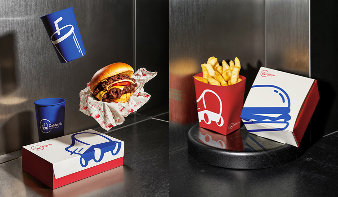
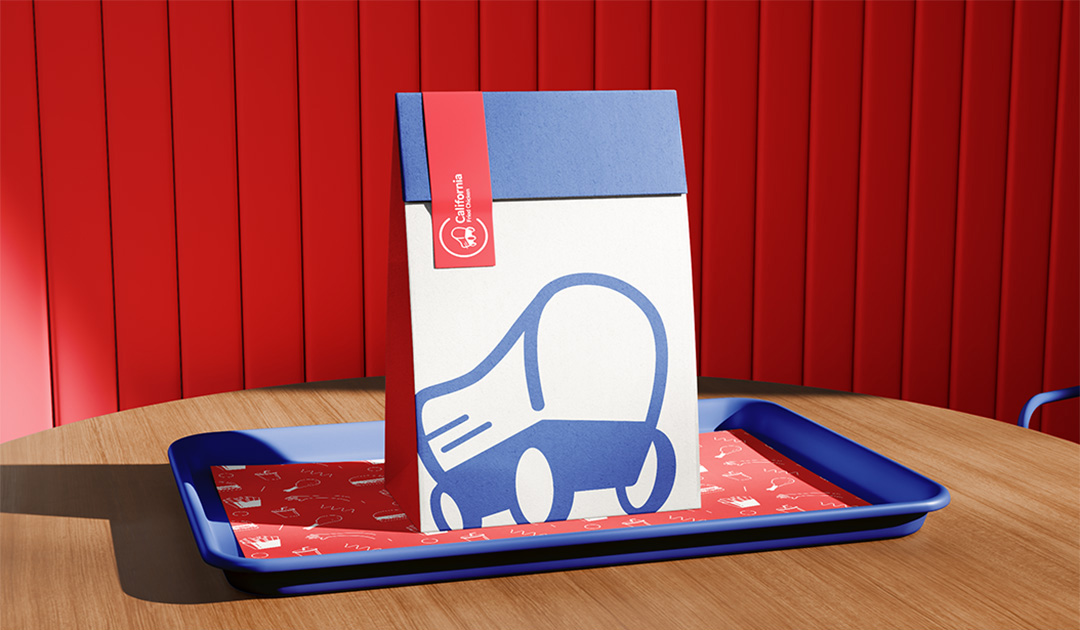
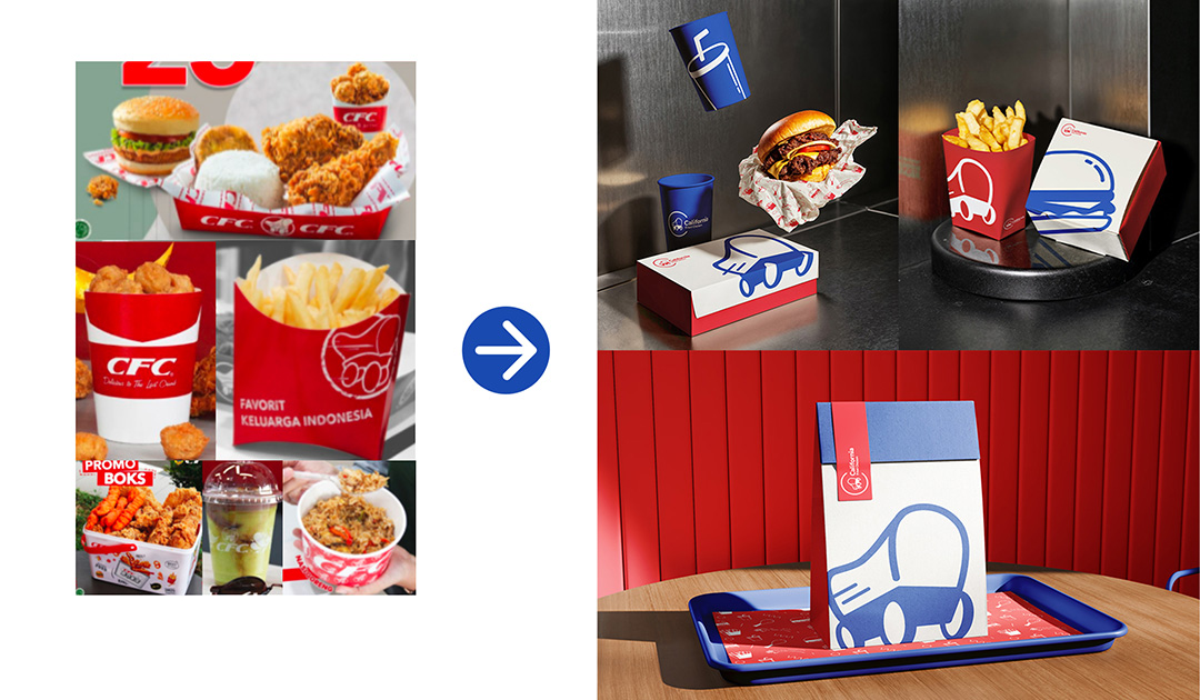
Packagings & Collaterals
For the packaging system, I prominently featured the wagon logogram while introducing product-specific icons, such as burgers or drinks, to differentiate packaging types. I paired the red-blue palette with playful illustrations to create a friendly and energetic brand personality.
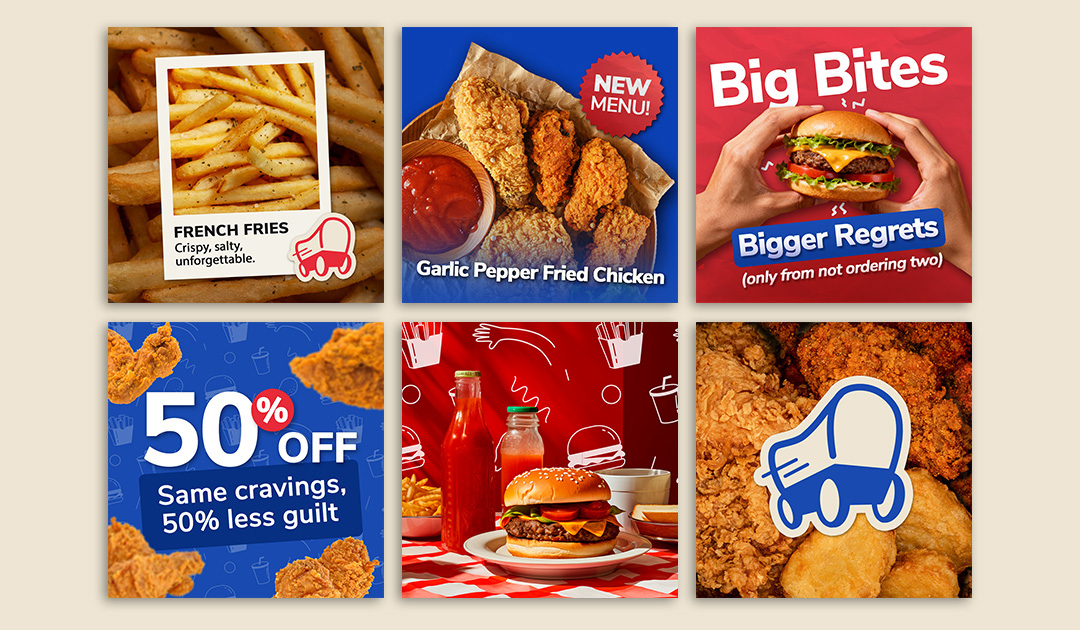
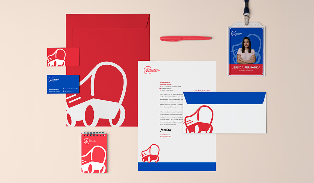
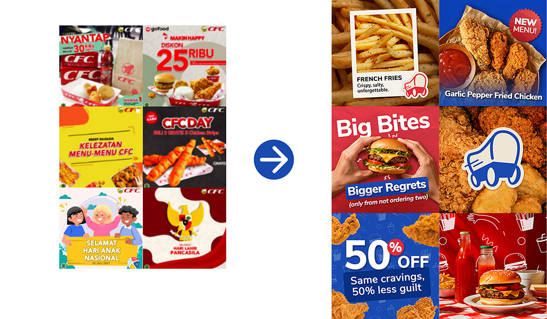
Social media visuals combine photography and illustration in a style consistent with the packaging graphics, supported by bold sans-serif typography for readability. Corporate collateral follows the same visual system, ensuring consistent brand recognition across all touchpoints.
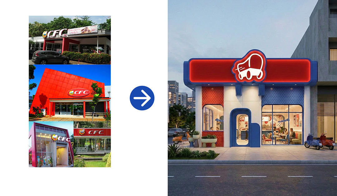
To further visualize the brand’s potential, I also explored a conceptual outlet redesign using AI-assisted rendering. The design translates the visual identity into a physical space, incorporating the red-blue color system, rounded architectural forms, and the wagon logogram as a prominent storefront sign to create a modern yet recognizable brand experience.
A Cohesive and Scalable Brand Identity
Results
Through this redesign, I established a cohesive and modern visual identity that improves clarity, recognition, and consistency across packaging, social media, and corporate collateral. By simplifying the Conestoga wagon and introducing a bold red-blue palette with playful illustrations, the new system strengthens brand differentiation while retaining recognizable heritage elements. The resulting visual language is flexible and scalable, allowing the brand to maintain consistency across both physical and digital platforms.
Refining Heritage through Design
Insights
This project strengthened my ability to translate research insights into a cohesive brand identity system. Balancing heritage with modern design required careful simplification, particularly when refining the Conestoga wagon while keeping it recognizable. It also reinforced the importance of consistency across touchpoints, showing how a clear visual system can make a brand feel more distinctive and contemporary.