ENCI: Bridging Ancient History and Modern Technology Through Visual Identity
Decoding the Past with Modern Tech
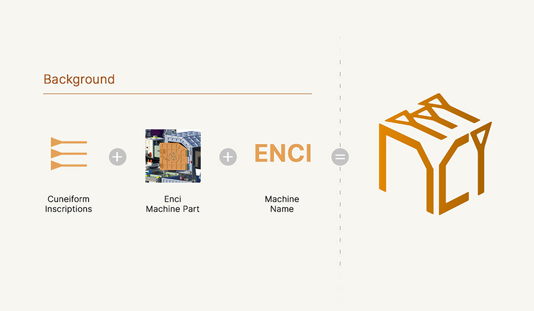
Background
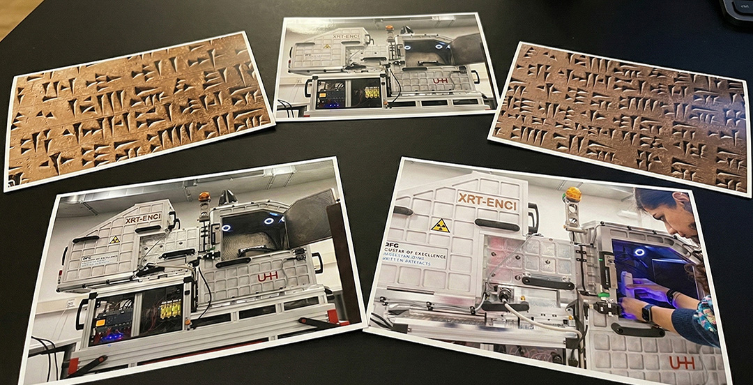
ENCI is a mobile computer tomograph developed by scientists at Universität Hamburg and DESY, designed to read 4,000-year-old cuneiform tablets without physically opening them. The technology allows researchers to study ancient inscriptions while preserving the artefacts, bridging cutting-edge imaging science with archaeology.
Project Goal
To develop a visual identity that communicates ENCI’s scientific innovation while honoring its archaeological significance — translating a highly advanced imaging machine into a symbol that feels intelligent, credible, and historically grounded.
Project Research: Searching Visual Foundations for ENCI
Initial Research
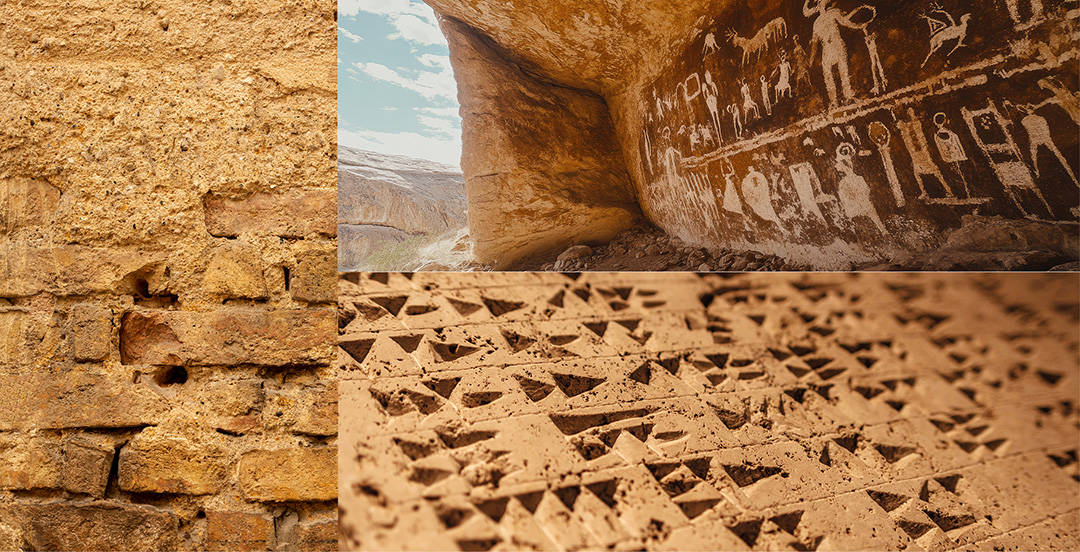
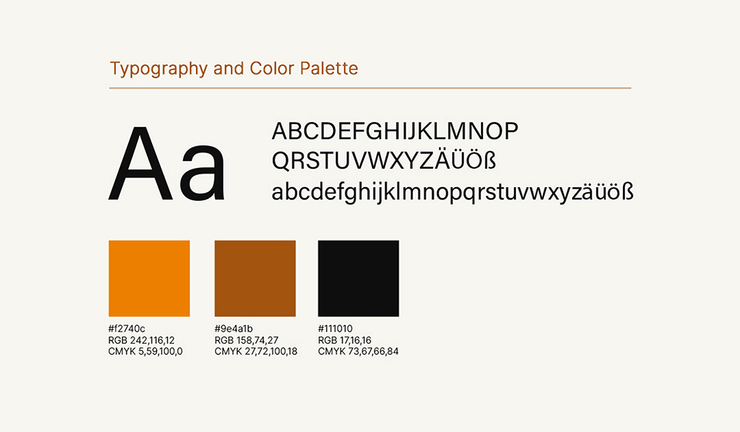
I studied two main references: the wedge-like forms of cuneiform inscriptions and the structural geometry of the tomograph machine. The contrast between organic historical marks and clean mechanical forms informed the foundation of the logo. The color palette draws from soil and artefact tones, reinforcing its archaeological context.
The Process: Developing the ENCI Identity
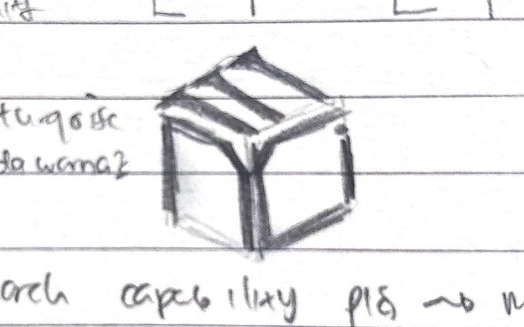
1. Preliminary Sketches
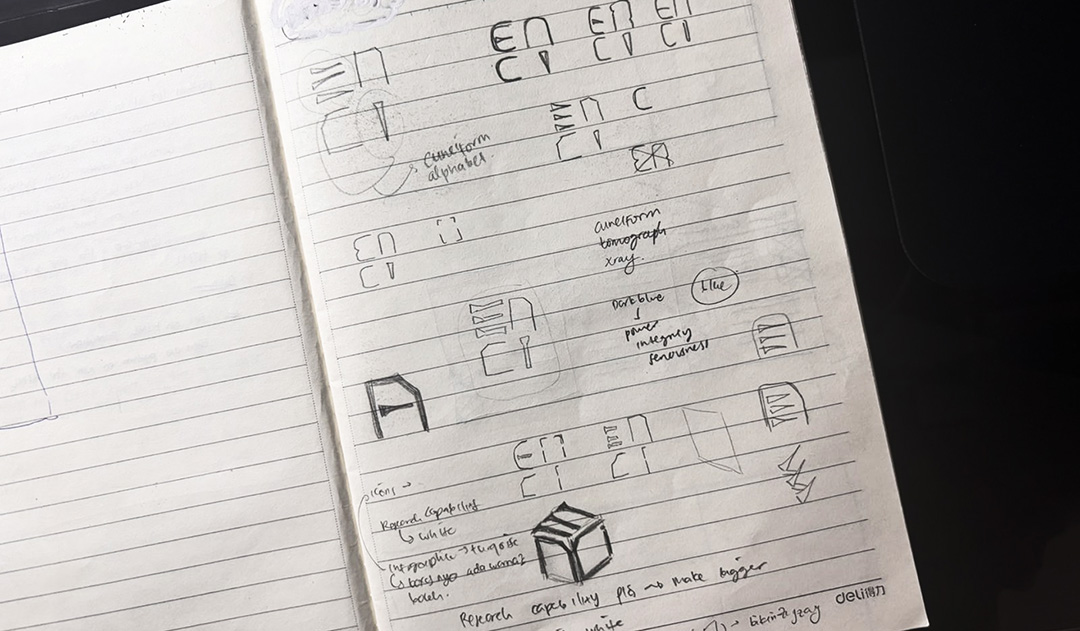
I experimented with forming “ENCI” using cuneiform-inspired wedges and elements derived from the machine’s structure. Through iterative sketches, I explored multiple compositions before refining the direction into a more cohesive and balanced form.
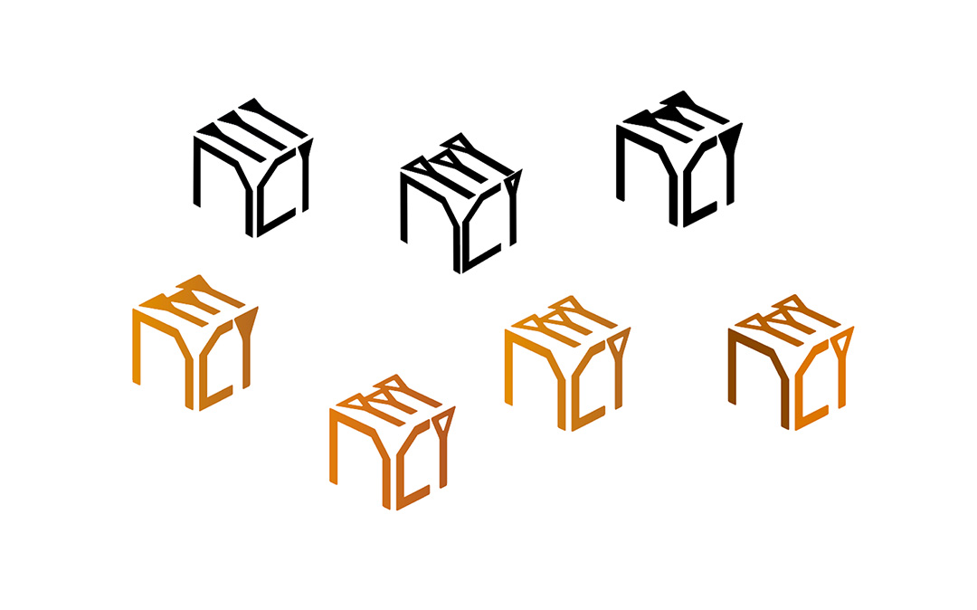
2. Refining the Sketch
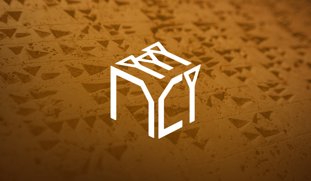
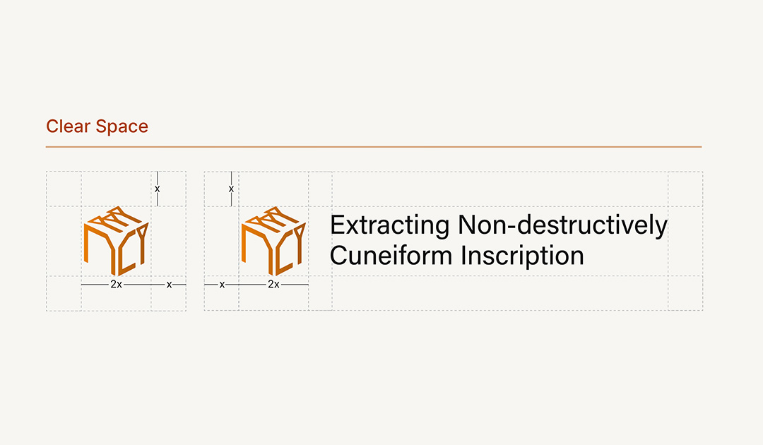
After testing various options, I selected the direction where the letterforms form a cube. The cube represents structure, stability, and three-dimensional depth — reflecting the tomograph’s scanning function. The E and I reference inscriptions, while the N and C derive from machine geometry, uniting both influences into one clear identity.
3. Further Exploration
With the cube direction established, I refined the cuneiform elements by adjusting proportions, shapes, and composition. I also explored earthy tones and gradient applications to enhance depth while maintaining clarity, scalability, and archaeological feel.
The Final Designs: ENCI's Identity
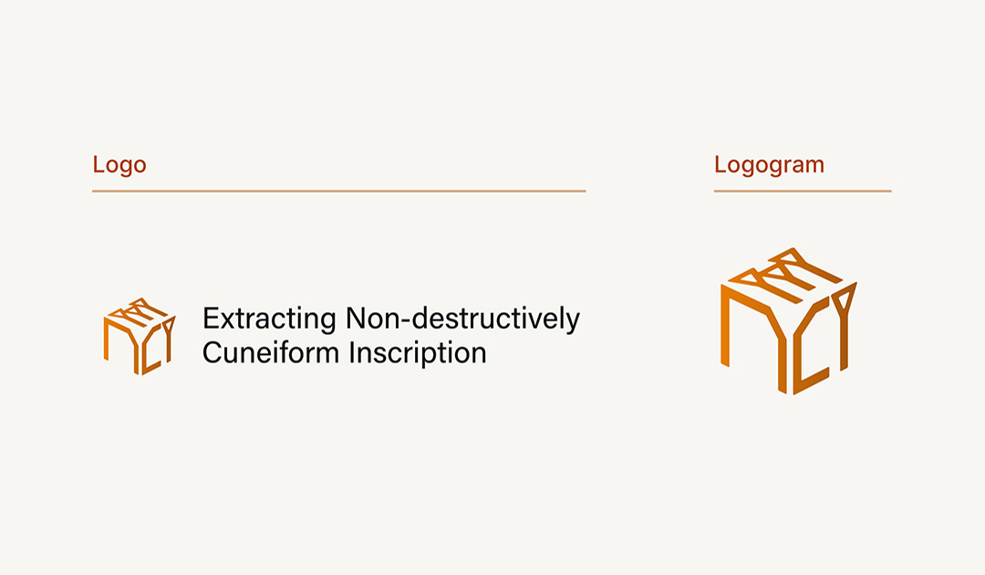
Logo
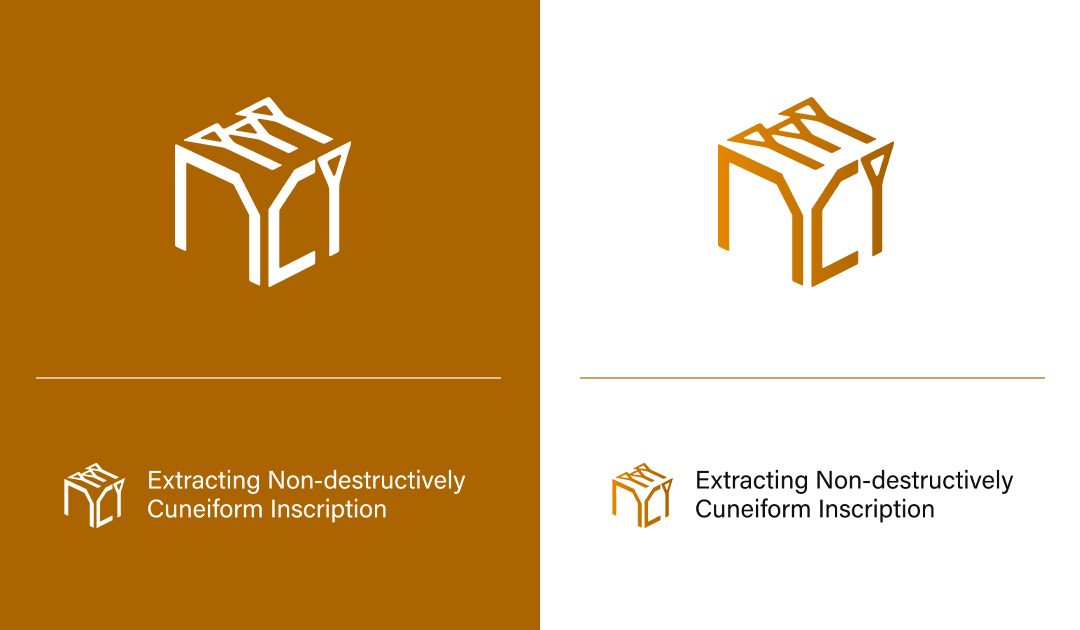
The final logo applies a single left-to-right gradient, enhancing the cube’s dimensionality while retaining a simple, scalable form. Cut-out details within the E and I create clearer definition, while consistent stroke weight maintains visual harmony across the letterforms.
Shaping a Machine’s Identity Through Design
Results & Impact
The final identity translates ENCI’s complex technical foundation into a clear and distinctive mark. By merging historical reference with structured form, the logo gives the machine a memorable and meaningful presence. As noted by the client, the design transformed “complex, technical ideas into a clear and genuinely beautiful logo,” giving the machine “a real soul and identity.”
Designing Across Disciplines
Reflection
Designing for ENCI required navigating between archaeology and advanced imaging technology. The process reinforced how thoughtful abstraction can translate complex systems into clear visual language without losing depth or precision.