Plastic Fish: Designing a Gamified Learning Experience to Raise Awareness of Microplastic Pollution
Educating on Microplastics: A Gamified Approach
Background
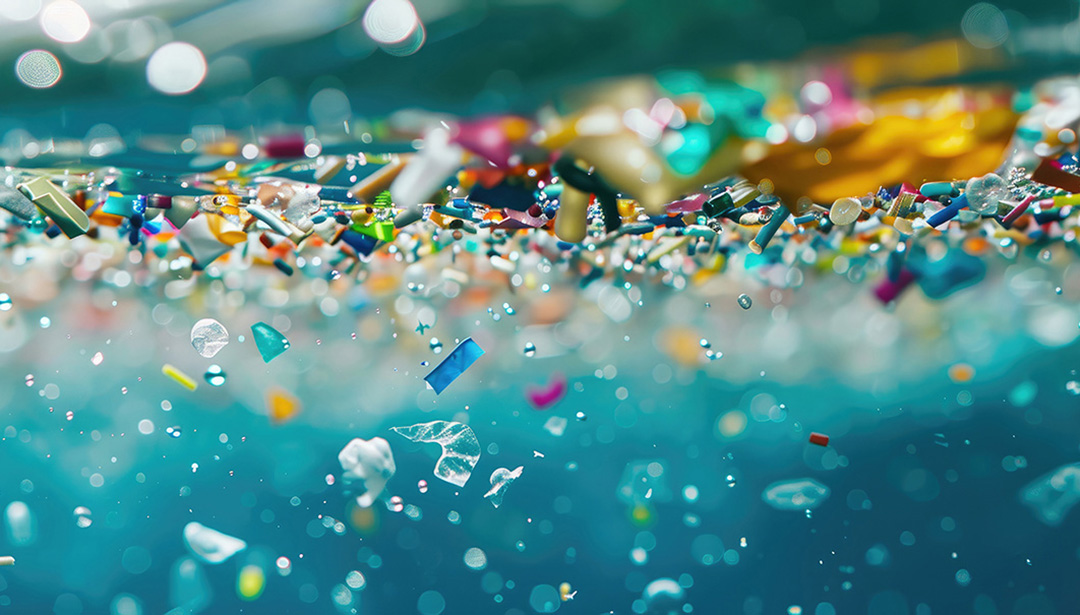
Microplastic pollution from everyday plastics is contaminating Indonesia’s rivers and seafood, entering the human body through fish consumption, yet public awareness remains low. This project develops a gamified website to educate users through interactive learning.
Project Goal
To raise awareness among Indonesians about microplastic pollution and its health effects from fish consumption through a fun, interactive experience that enhances engagement and retention.
Project Research: Understanding Microplastics and User Needs
Microplastics in Indonesia
Microplastics from waste and products like scrubs contaminate Indonesian rivers and accumulate in fish, posing health risks to humans. A survey of Indonesians aged 18–40 showed that less than half (44%) understood the potential health risks of microplastics, highlighting the need for educational efforts.
Gamification in UX
Gamification enhances engagement, motivation, and learning when thoughtfully applied. Key principles include clear goals, balanced challenges, flexible rules, immersive environments, and user control over content and aesthetics. These guided the interactive elements of the website.
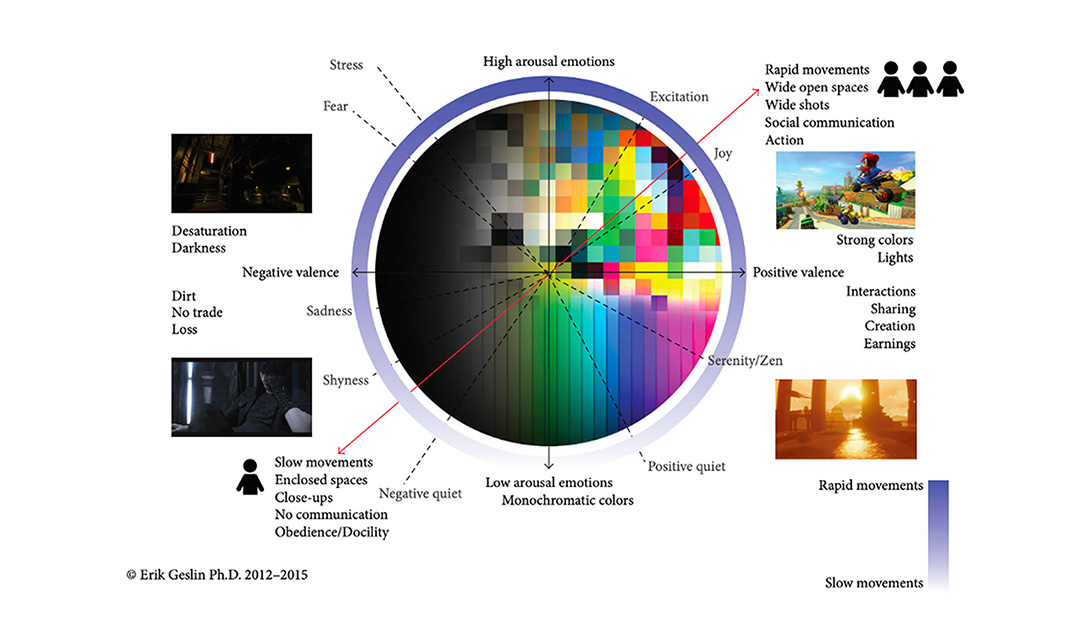
Colours and Attention
Bright, high-contrast colors improve focus and memory recall. Consistent palettes between learning and retrieval phases strengthen retention. Colors also influence emotional arousal, affecting feelings like joy, fear, or calmness, which further supports engagement. Strategic use of color guides attention, highlights key information, and reinforces the learning experience.
Defining the Target Market
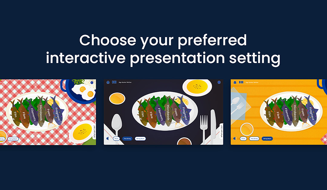
The website targets students, teachers, and environmental volunteers, supporting interactive learning from elementary level onward. Customizable paths in English and Indonesian engage users aged 10–50. Gamified elements appeal to younger audiences, while older users may encounter minor tech challenges.
Pain Points & Opportunities
Challenges:
- Low public awareness of microplastic risks
- Complex scientific content that is difficult to understand
- Existing education methods fail to engage users
Opportunities:
- Gamified, interactive elements make learning engaging
- Visually appealing design simplifies complex information
- The website encourages proactive behavior to reduce microplastic consumption
The Process: Developing and Designing the Gamified Website
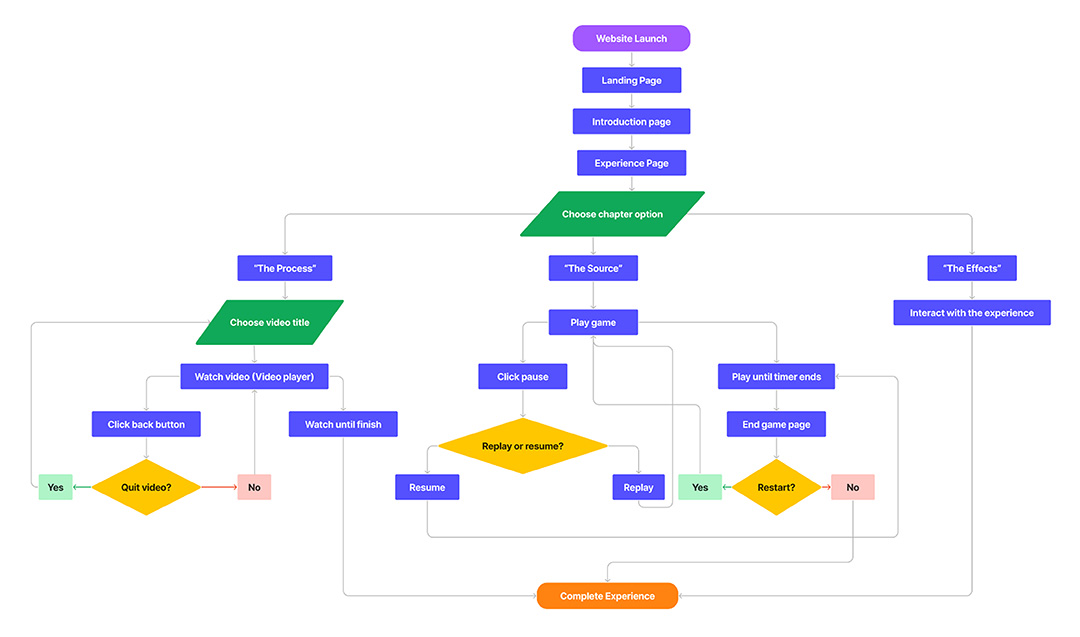
1. User Flow
Users navigate through three chapters:
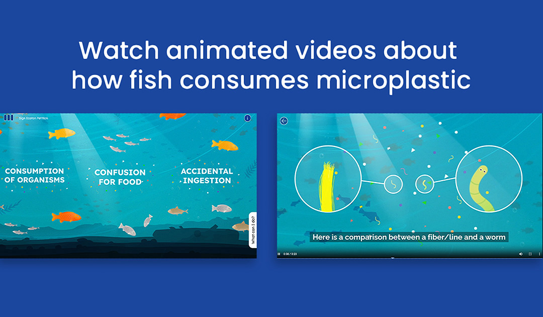
- The Process – Animated videos explaining microplastic consumption by fish.
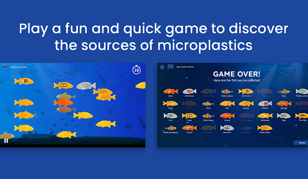
- The Source – A timed mini-game where users spot and click contaminated fish.
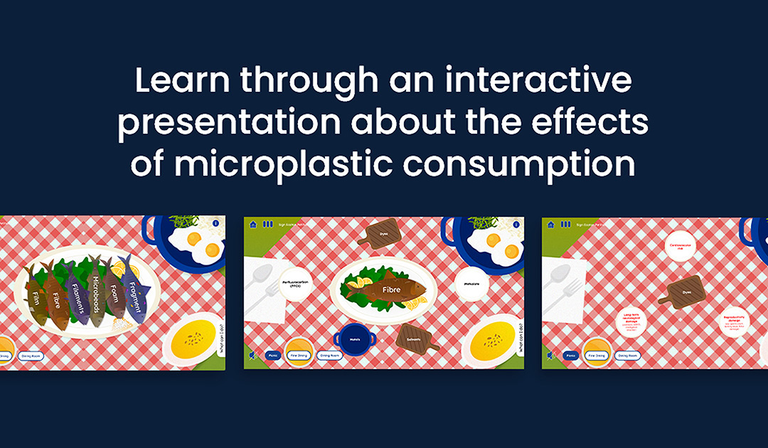
- The Effects – An interactive presentation showing chemical exposure and health impacts via dining table simulations.
I incorporated gamification through goal-setting, challenges, time constraints, visual/audio feedback, and user control over themes. These elements reinforce engagement and knowledge retention throughout the experience.
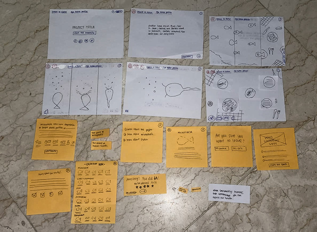
2. Design & Prototyping
During prototyping, I used paper prototypes to explore layout, navigation, and content hierarchy. Feedback from focus groups led me to simplify the mini-game by removing scoring and pop-ups, reducing cognitive load and making the experience more intuitive.
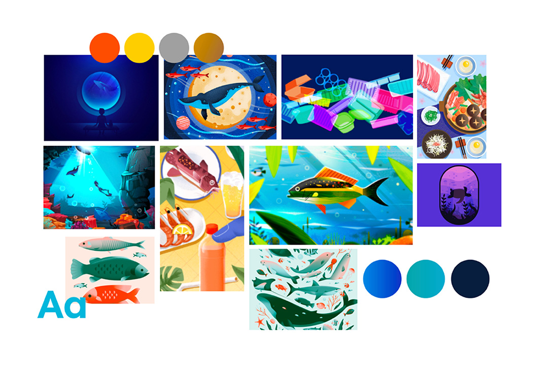
3. Moodboard
The moodboard drew inspiration from underwater environments and emotional cues, guiding illustration, color schemes, and thematic elements to create a cohesive, immersive experience.
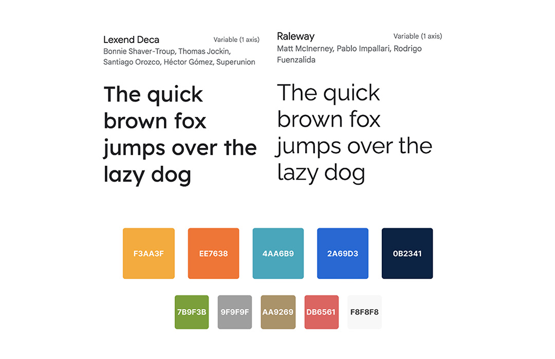
4. Typography & Colours
I selected typography and color to support readability and engagement. Body text uses Raleway, while headings use Lexend Deca to establish hierarchy and personality. The blue-green color palette reflects underwater tones, reinforces emotional cues, and ties the visual system together.
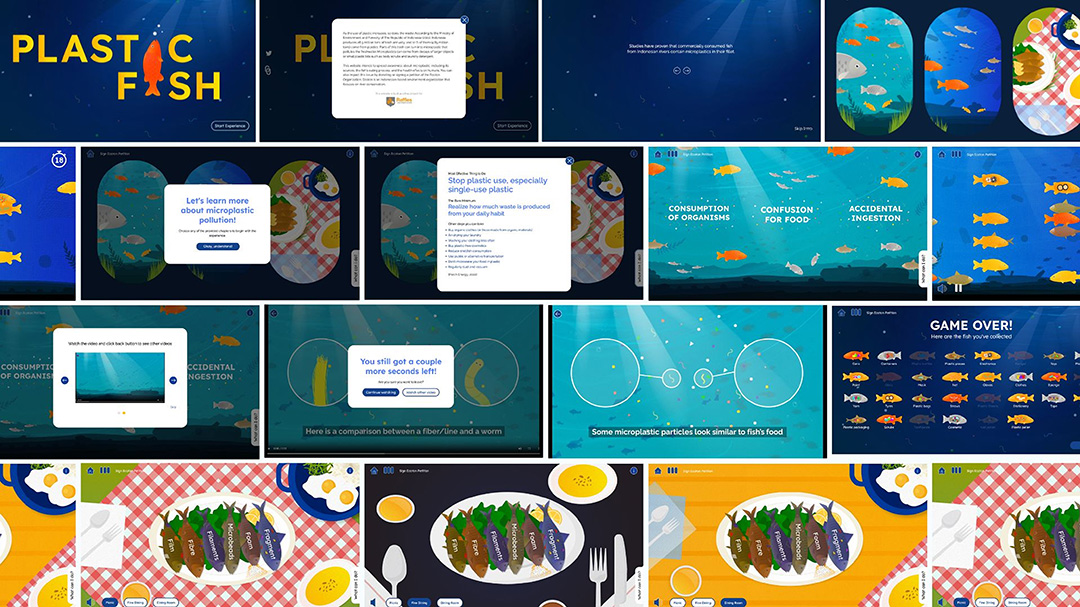
5. High-Fidelity Designs
The initial prototypes were polished into high-fidelity design of the final UI screens. This process included illustrating all design assets and creating the motion graphic videos. Users start at the landing page, navigate through intro messages, and select one of three chapters. Pop-ups and micro-interactions guide users and enhance engagement.
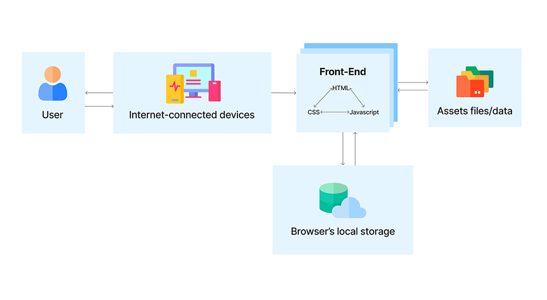
6. Web Development
I developed the site with HTML, CSS, and JavaScript. The site is optimized for 1440×820 px (desktop) and 892×400 px (tablet) to ensure consistent layout and interactions across primary user devices. Support for other screen sizes could be addressed in future iterations.
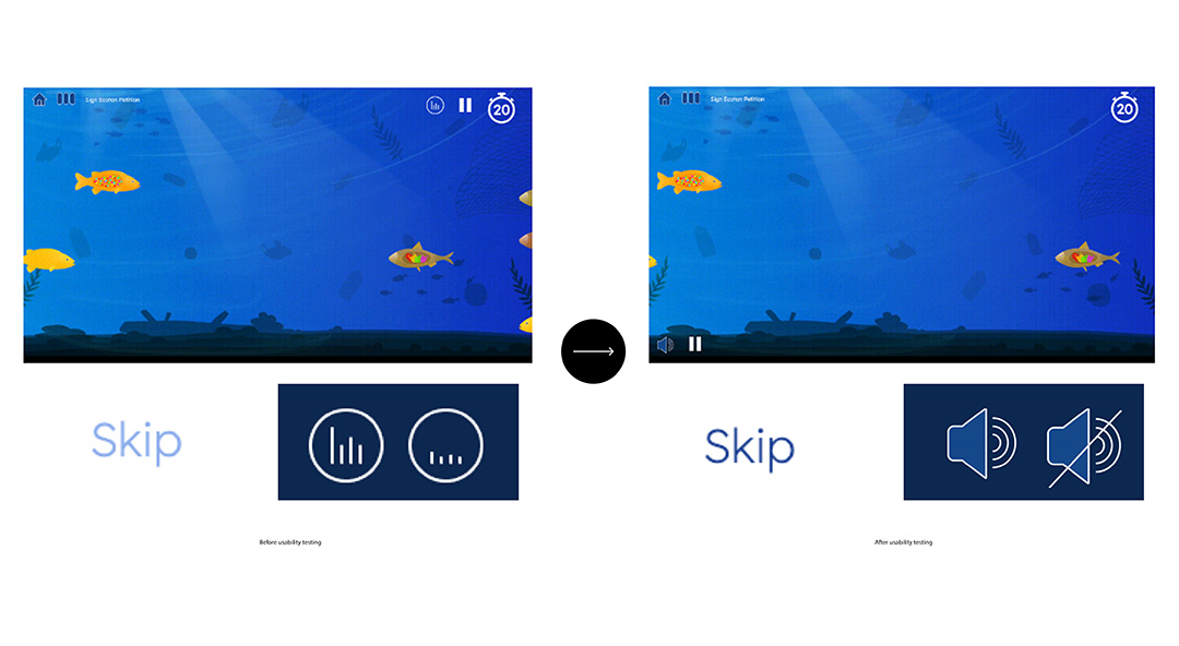
7. Usability Testing
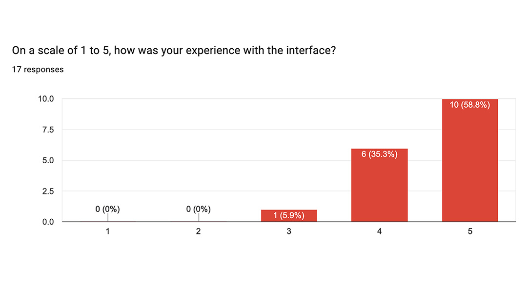
I conducted an unmoderated remote test with 16 participants (16–40 years old, Indonesians and foreigners). Users completed pre-test questionnaires, interacted with the website, and answered post-test questions on navigation, interactivity, visuals, and engagement. Findings:
- The experience was engaging and educational.
- The mini-game (“Source”) received the highest positive feedback.
- Users suggested minor improvements to audio controls, pop-ups, and animation pacing.
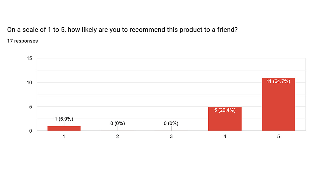
Overall, 15 out of 16 participants rated the interface positively and indicated they would likely recommend it, confirming that the website effectively educates and motivates users about microplastic pollution.
The Final UI: Plastic Fish Visuals and Interactions
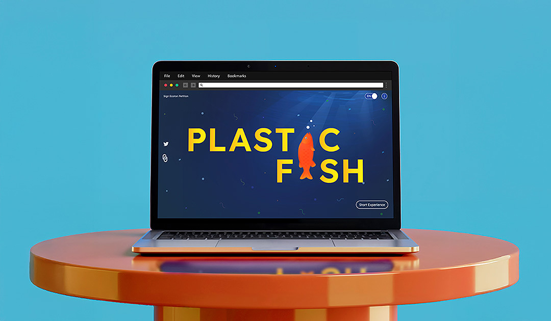
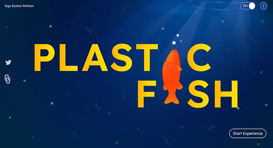
Landing Page
The landing page prominently displays the project title, Plastic Fish, with clear entry points via the “i” icon or the “Start Experience” button. Secondary buttons for the Ecoton petition, additional information, and a language toggle (English/Indonesian) are positioned in the top corners, remaining accessible without distracting from the main call-to-action. This design sets the tone for the overall experience.
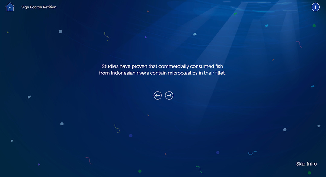
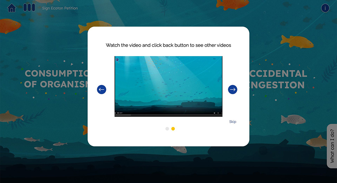
Intro Messages & Pop-ups
Intro messages guide users through the beginning of the experience with clear, intuitive navigation. Left and right arrows are placed below the text for easy access, while a skip button in the bottom-right provides an alternative way to move forward.
Separate pop-ups appear at key points to provide instructions, explain chapter options, and indicate progress. A “What Can I Do?” button offers actionable steps for users to reduce plastic pollution, linking the experience to real-world impact.
Chapter Selection
After the introduction, users select one of three chapters. Hovering over options reveals chapter titles for clarity. This interaction provides immediate feedback and guides user choice.
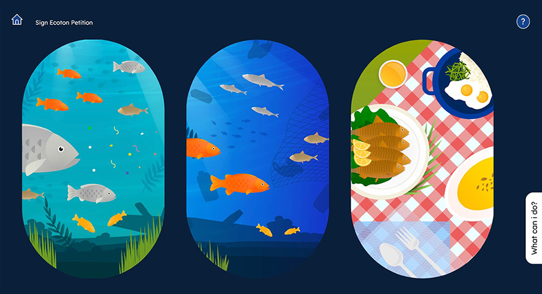
Chapters Overview
The experience is structured into three chapters:
- The Process: Users select from three animated videos, with hover effects and consistent backgrounds maintaining visual cohesion.
- The Source: A timed mini-game where users spot and click contaminated fish, reinforced by sound effects and gamified challenges.
- The Effects: Users explore human health impacts by interacting with sliding plates on a dining table, enhanced by adaptive background music to create immersion and presence.
How Users Experienced Plastic Fish
Results & Impacts
User testing showed that the majority of participants understood the key information in each chapter, finding the experience engaging and educational. The “Source” mini-game received the highest positive feedback, while animations, illustrations, and interactive elements enhanced attention and retention. Users suggested minor improvements, such as adjusting audio controls, pop-up buttons, and animation pacing. Overall, 15 out of 16 participants rated the interface positively and indicated they would likely recommend it, demonstrating that the website effectively educates and motivates users about microplastic pollution.
What Worked and What’s Next for Plastic Fish
Insights
This project highlighted the value of combining gamification, interactivity, and visual storytelling to educate users about microplastics. Through testing, I realized the design could be enhanced with more varied fish illustrations, smoother animations, and additional game mechanics to increase engagement. Future iterations could explore deeper interactivity, such as showing microplastics inside fish fillets or integrating AR/VR features. User testing could also benefit from moderated sessions and a broader demographic to gather richer insights. Overall, the experience reinforced the importance of balancing educational content with immersive, intuitive design.